

Quick Theme
Quick is a modern and highly flexible HubSpot theme built for IT companies, digital agencies, SaaS startups, software businesses, and technology-focused websites. Designed with a clean visual system and conversion-focused layouts, Quick helps businesses create professional, high-performance websites with ease—without requiring any coding knowledge.
The theme includes a powerful collection of custom-built drag-and-drop modules, multiple header and footer variations, portfolio and case study layouts, blog components, testimonial sections, service showcases, CTA sections, and fully customizable landing page elements. Every module is built with responsiveness, scalability, and HubSpot Marketplace best practices in mind.
Quick combines elegant minimal design with advanced customization controls, allowing marketers and developers to easily adapt colors, typography, spacing, layouts, buttons, cards, sliders, and global sections directly from the HubSpot Design Manager and theme settings.
Built for speed, usability, and flexibility, Quick delivers a seamless experience across desktop, tablet, and mobile devices while maintaining clean code architecture and optimized performance.
Requirements
To use this theme, you must have an active HubSpot account. If you don’t already have one, you can sign up for free.
Once you're logged into your HubSpot account, you can access and work with the theme through the Design Manager or your HubSpot portal.
Installation: Upload via HubSpot Marketplace
- Go to Marketing > Website > Website Pages.
- Click Create > Website Page.
- In the Theme selector, find your installed Marketplace theme.
- Choose your desired template to start editing.
Theme Settings
Quick includes a powerful and easy-to-use Theme Settings panel that allows you to customize the overall appearance and styling of your website without editing code. From typography and colors to spacing and layout controls, all global styling options can be managed directly within the HubSpot content editor.
To customize your theme settings, start by creating a page using one of the Quick theme templates. In the page editor, navigate to the left-hand sidebar and open the Theme tab. Then click Edit theme settings to access the global customization panel.
Using the Theme Settings panel, you can easily:
- Update brand colors and background styles
- Change typography and font settings
- Adjust global spacing and layout widths
- Control section padding and border radius
- Configure header and footer styling
- Maintain consistent branding across all pages
All changes made in Theme Settings are applied globally throughout the website, helping you build a consistent and professional digital experience quickly and efficiently.
Quick is designed to provide maximum flexibility while keeping the editing experience simple and intuitive for marketers, designers, and developers alike.
Global Headers
Quick includes multiple professionally designed global header variations that can be applied across your entire website. The theme currently provides 4 standard header variants and 2 landing page header variants, allowing you to quickly switch between different navigation styles based on your website requirements.
To configure your global header:
- Open any page built using a Quick theme template.
- Navigate to the header section in the edit page.
- Click to open global header.
- Select your preferred header variant from the available options.
Once selected, the chosen header will automatically apply globally across all pages using the theme, ensuring a consistent navigation experience throughout the website.
Each header variant includes its own unique layout and styling options, such as:
- Navigation menu styles
- CTA button controls
- Top information bars
- Contact information
- Social media icons
- Sticky header behavior
- Transparent header options
In addition to selecting a header layout, you can also customize the header directly from the Theme Settings panel, including:
- Background colors
- Menu text colors
- Menu background colors
- Hover and active states
This flexible system allows you to maintain a consistent global header while still adapting the design to match your brand identity and website goals.






Global Footers
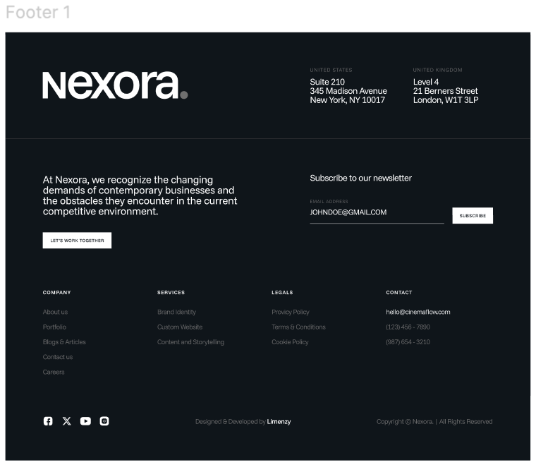
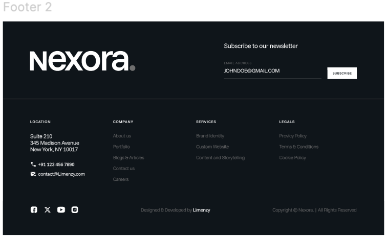
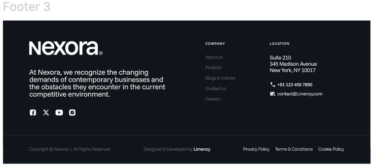
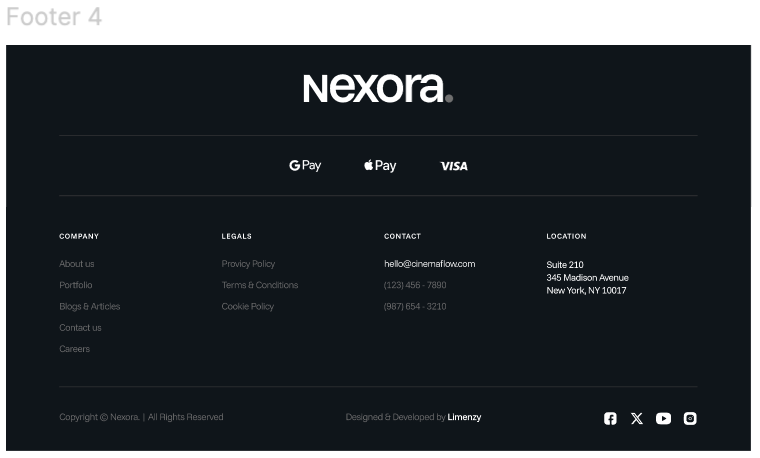
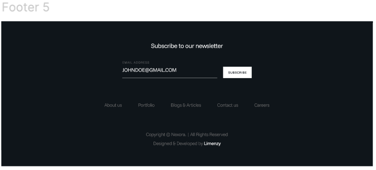
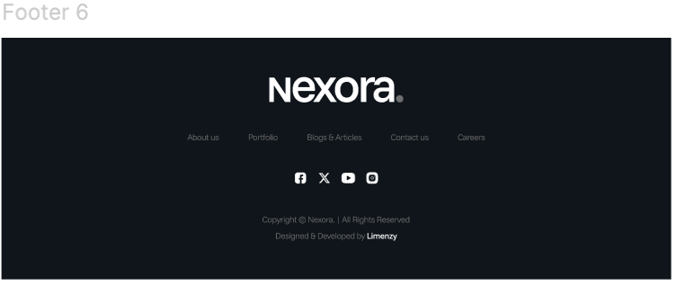
Quick includes 6 professionally designed global footer variants that can be applied across your entire website. These footer layouts are built for modern IT companies, SaaS businesses, startups, agencies, and technology-focused websites.
Once a footer variant is selected, it will automatically appear globally throughout all pages using the theme templates.
Each footer includes different layout styles such as:
- Newsletter subscription sections
- Multi-column navigation menus
- Company contact information
- Social media icons
- Payment icons
- Minimal centered footer layouts
How to Change the Global Footer
- Create or open a page using a Quick theme template.
- In the page editor, open the footer global module.
- Choose your preferred footer variant from the available footer layouts.
- Save and publish your changes.
The selected footer will automatically update across all pages using the Quick theme.
Footer Customization Options
Inside the Theme Settings, you can customize various footer elements including:
- Background colors
- Text colors
- Spacing and layout controls
- Rest all styles you can change from footer module settings
Global Settings
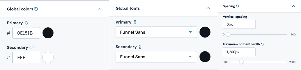
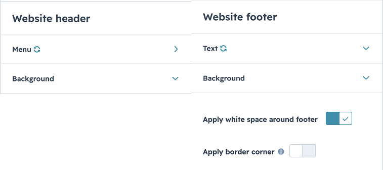
The Quick theme includes a centralized Global Settings panel that allows you to manage your website’s core design styles and branding from one place. These settings automatically apply across all pages and modules using the theme.
Through Global Settings, you can easily customize:
- Brand colors
- Typography and fonts
- Global spacing
- Container widths
- Header and footer selection
- Form styles

Pages
- Home
- About us
- Portfolio
- Case study
- Services
- Contact Us
- Blog
- Terms & conditions
Modules
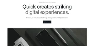
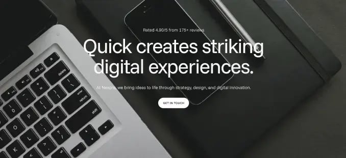
Home Banner
- Ability to update all heading and subheading text content dynamically.
- Option to change the font color for all heading texts.
- Support for rich text content where applicable.
- Editable button label and URL.
- Option to customize:
- Background color
- Font color
- Button alignment
- Option to enable/disable a secondary CTA button.
- Option to change the module background color.
- Adjustable spacing controls.
logo-slider
- Slider functionality to showcase:
- Logos and Images
- Smooth horizontal logo slider showcasing partner/client brands.
- Clean and minimal layout with evenly spaced logos.
- Responsive design optimized for desktop, tablet, and mobile devices.

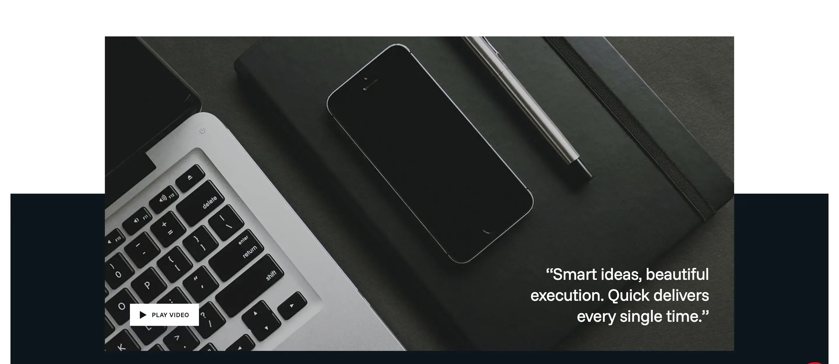
VIDEO SHOWCASE
- Ability to add a popup video within the module.
- Video opens in a popup when clicked.
- Display a custom video thumbnail image on the page.
- Ability to add a short descriptive text or caption over the thumbnail.
STATS HIGHLIGHT
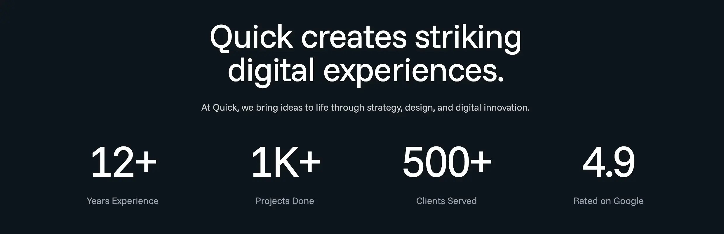
- Ability to show or hide the heading text.
- Option to select the heading tag dynamically:
- Option to show or hide the divider between the statistic items/texts.
- Editable statistic values and supporting text content.
- Ability to update font colors for:
- Heading text
- Statistic numbers
- Supporting text
- Divider
- Option to change the module background color.
- Ability to customize border radius for the background.
- Adjustable spacing controls.
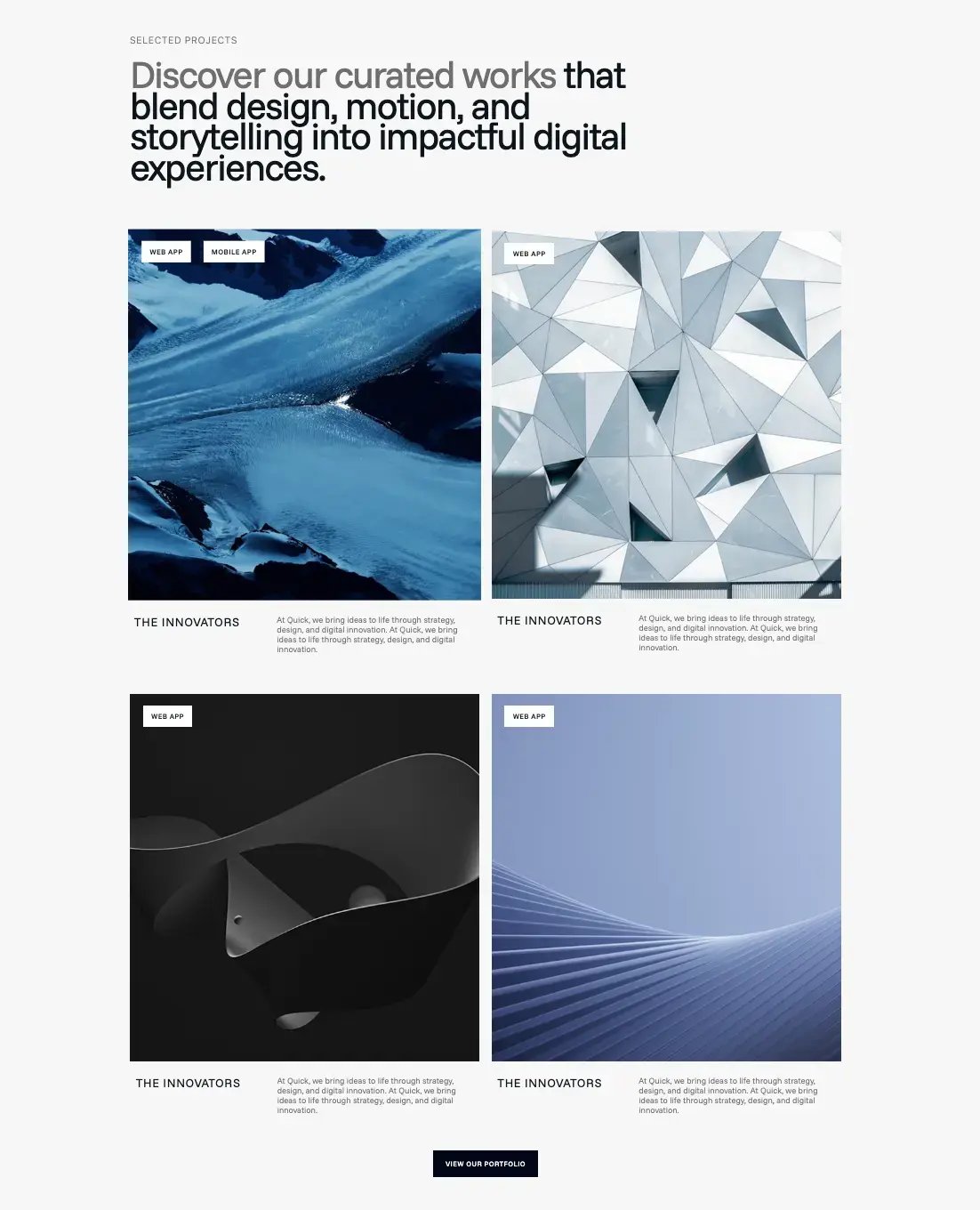
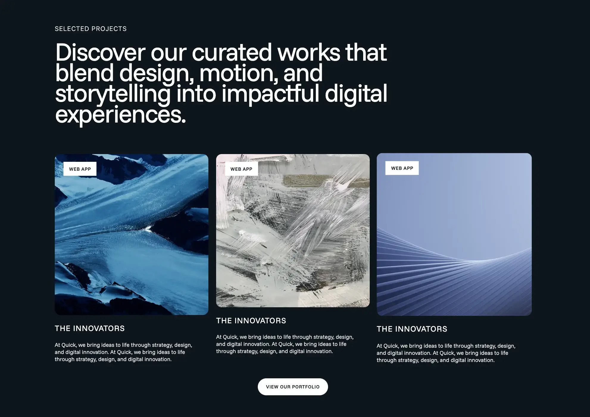
WEBINAR CARDS
- Dynamic project/webinar listing module with repeatable card functionality.
- Ability to add:
- Title
- Description
- Tag
- CTA button/link
- Ability to upload or replace card images.
- Option to add links to images.
- Support for clickable image functionality redirecting to internal or external URLs.
- Ability to change the font color for all text elements in the module.
- Option to customize:
- Module background color
- Button background and font colors
- Option to choose the layout style of the cards/boxes:
- Grid layout
- 3 cards in a row
- Adjustable spacing controls.
Client Cards
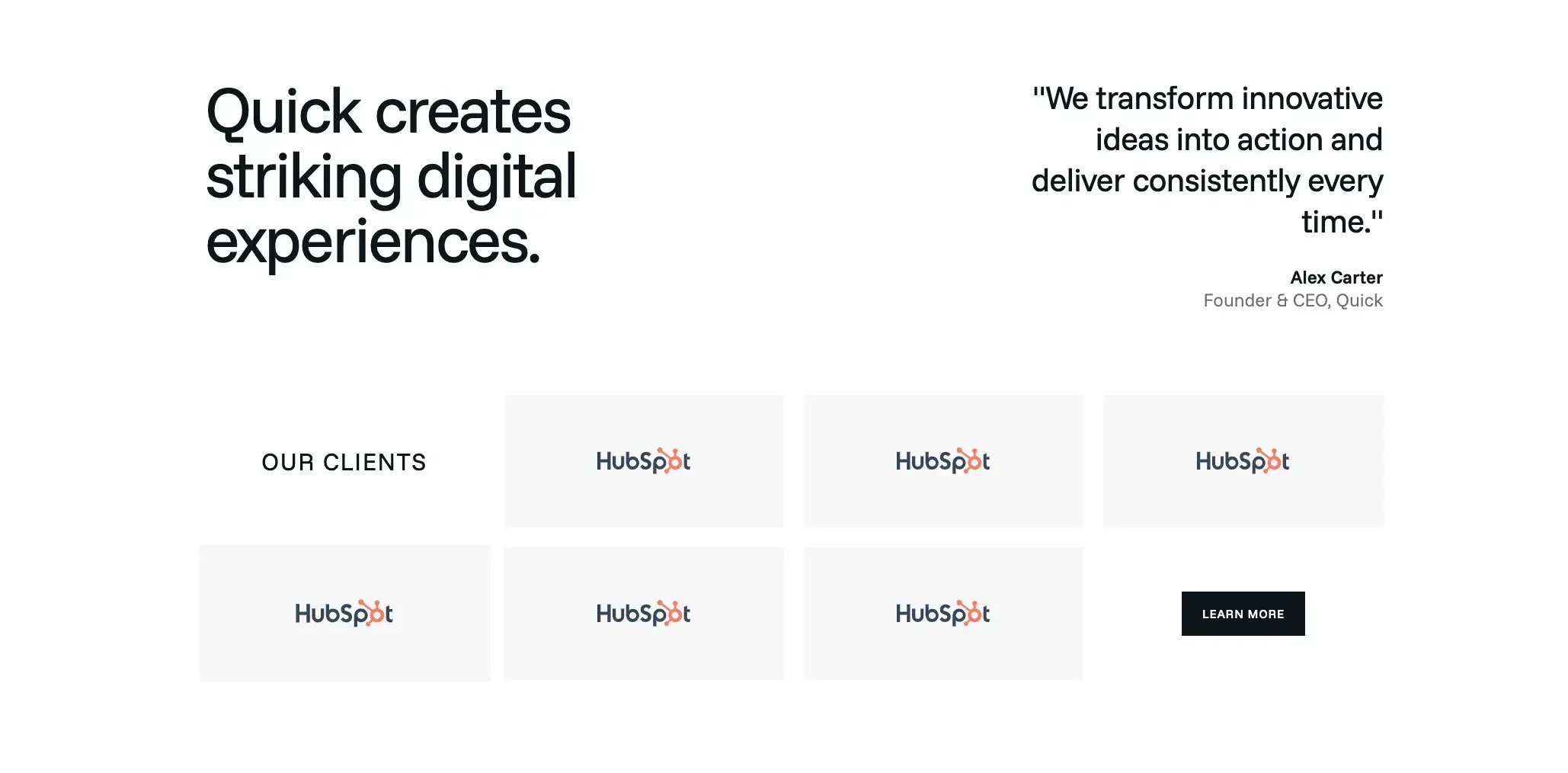
- Ability to add and manage multiple client logos dynamically.
- Option to upload/replace client logo images.
- Ability to change the font color for all text elements within the module.
- Option to customize:
- Module background color
- Client logo card background color
- Button background color
- Button font color
- Option to enable/disable CTA button.
- Editable button text and link.
SERVICE FEATURE CARDS
- Ability to choose the module layout type:
- Fixed layout
- Scrollable layout
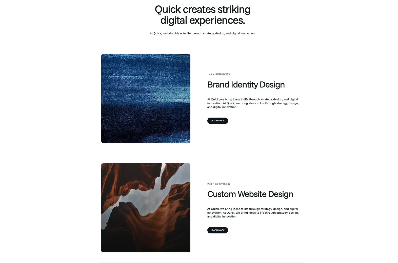
- Dynamic repeatable cards/content sections.
- Ability to add and manage:
- Title
- Description
- Image
- CTA button/link
- Option to upload or replace images for each card/content section.
- Option to show or hide:
- Title
- Description
- CTA button
- Individual visibility controls for each content section/card.
- Ability to change the font color for all text elements within the module.
- Option to customize:
- Module background color
- Button background and font colors
- Adjustable spacing controls.
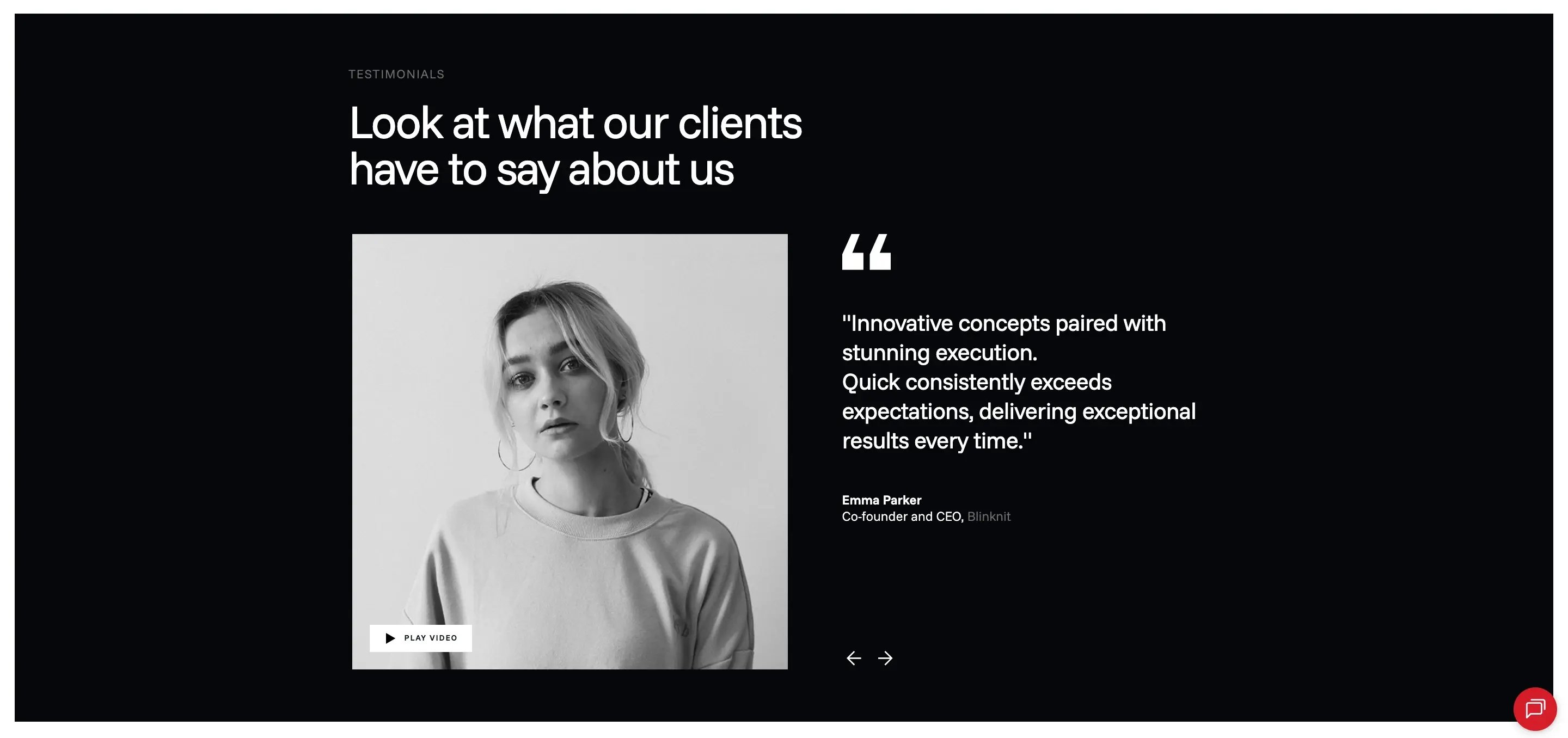
TESTIMONIAL SLIDER
- Slider functionality to showcase:
- Testimonials
- Images and videos
- Dynamic repeatable testimonial items/cards.
- Ability to upload or replace:
- Images
- Videos
- Support for video thumbnails video playback.
- Editable fields for:
- Testimonial text
- Client name
- Designation/company name
- Supporting description
- Ability to change the font color for all text elements within the module.
- Option to configure:
- Sliding speed
- Autoplay enable/disable
- Ability to customize:
- Module background color
- Arrow color
- Quote icon color
- Play button background color
- Adjustable spacing controls .
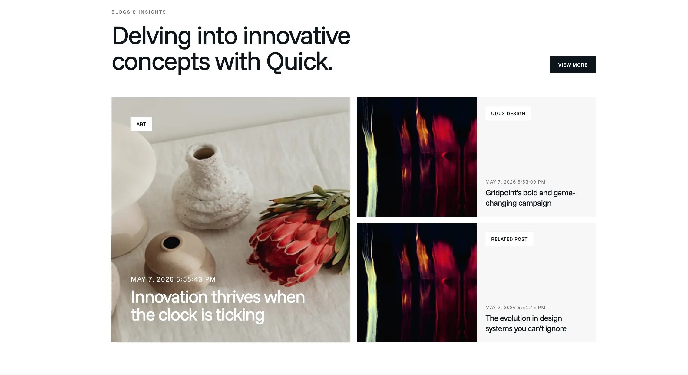
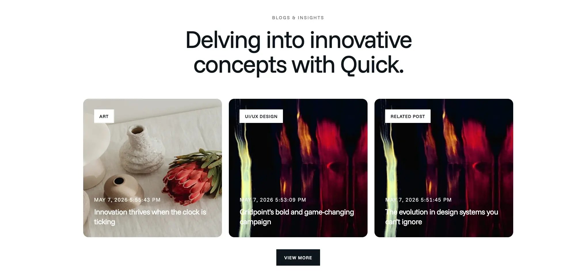
BLOG SECTION
- Choose between:
- Featured post + side cards layout
- Three cards in a row layout
- Ability to change the font color for all text elements within the module
- Configurable module background color
- Adjustable spacing controls .
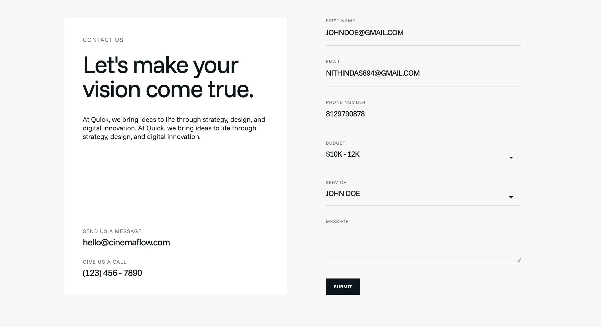
CONNECT US
- Editable Contact Us form
- Ability to add, remove, or modify form fields
- Option to set specific fields as required
- Editable font color for all text elements
- Configurable background color
- Adjustable spacing controls.
FAQ
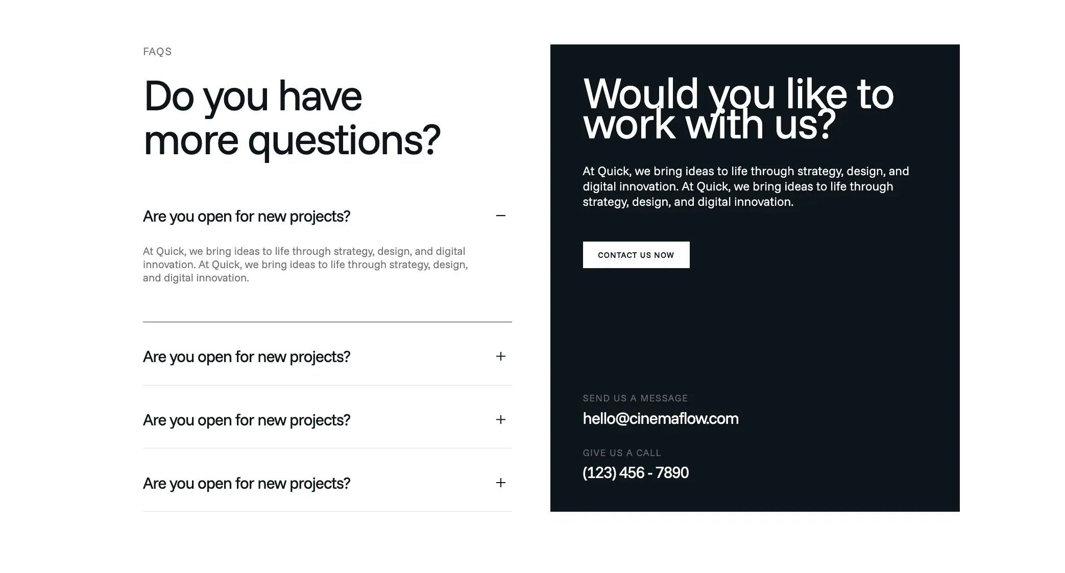
- Choose FAQ layout:
- FAQ only
- FAQ with right-side content
- Add, edit, and remove FAQ items
- Expand/collapse accordion functionality
- Editable left and right section and content styling
- Ability to customize:
- Font colors
- Background color
- Accordion styles/icons
- Adjustable spacing controls.
SINGLE TESTIMONIALS
-
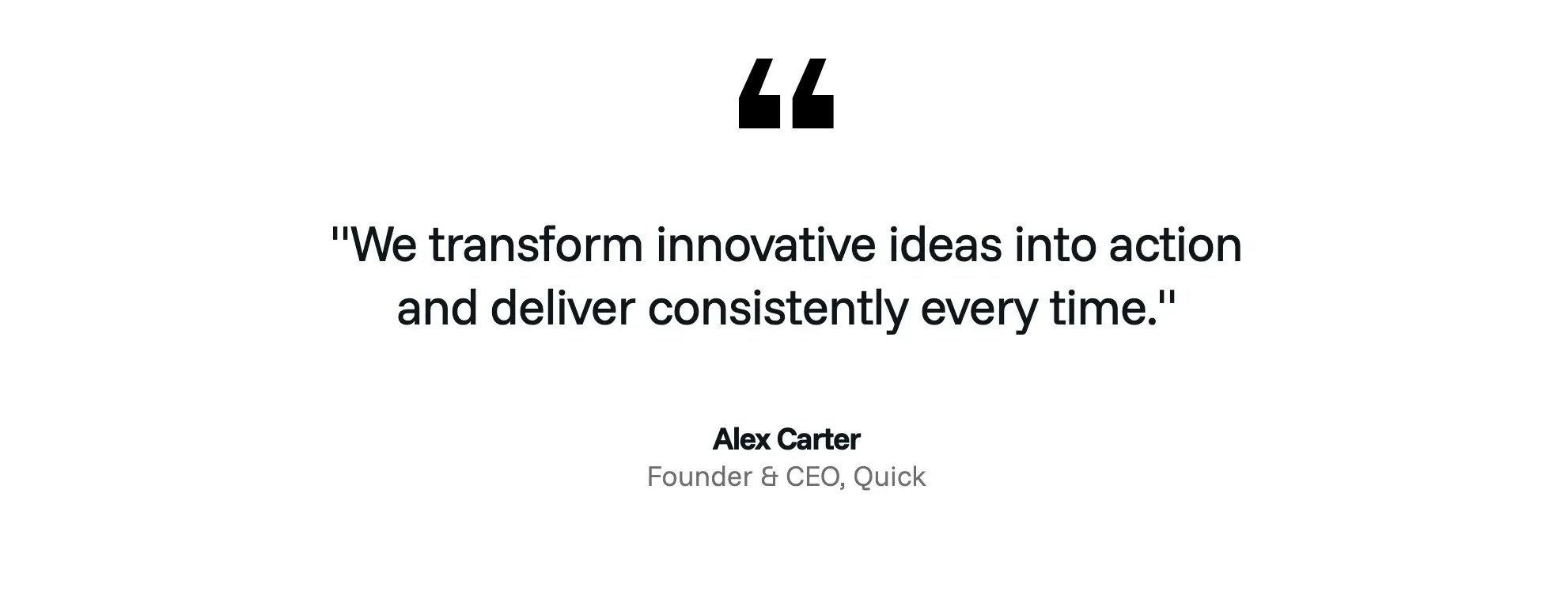
A testimonial module featuring:
- Testimonial quote
- Author name
- Author designation
- Top quote icon
Customizable options include:
- Text/font colors
- Background color
- Quote icon color
- Spacing and padding controls
deal for showcasing customer feedback, reviews, or brand testimonials in landing pages, homepages, and marketing sections.
CONTENT WITH IMAGE
A split-layout module featuring content on the left and an image on the right.
- Eyebrow text
- Heading
- Description
- CTA button
- Right-side image
- Edit font properties for eyebrow, heading, and description
- Font size
- Font weight
- Font color
- Editable button label and button URL
- Image upload/change option
- Adjustable spacing controls.

REVIEW CARD
A flexible content module with support for mixed media and customizable content sections.
- Ability to add text, quotes, images, and videos within the module
- Show/hide option for eyebrow text
- Show/hide option for heading text
- Editable CTA button label and URL
- Ability to update/change images and videos as needed.
- Change module background color
- Change card background color
- Customize font colors
- Adjustable spacing and padding controls
- Flexible card-based content structure
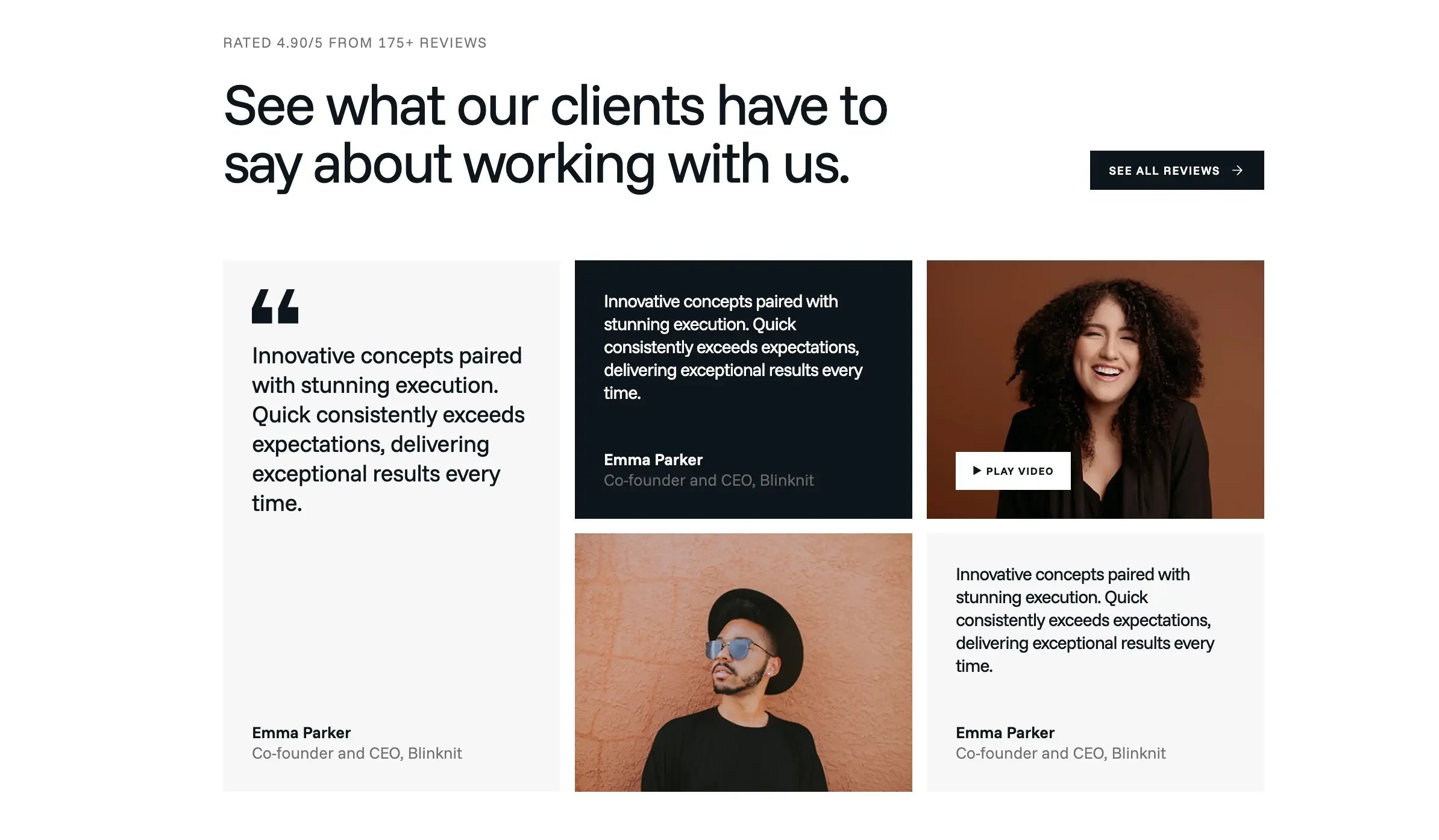
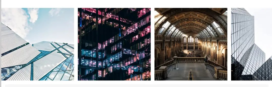
IMAGE SLIDER
- Ability to add and manage multiple slider images.
- Full-width responsive layout.
- Automatic slider/carousel functionality.
- Smooth slide transition effects.
- Adjustable spacing and padding controls.
IMAGE SLIDER
- Ability to add and manage multiple slider images.
- Full-width responsive layout.
- Automatic slider/carousel functionality.
- Smooth slide transition effects.
- Adjustable spacing and padding controls.
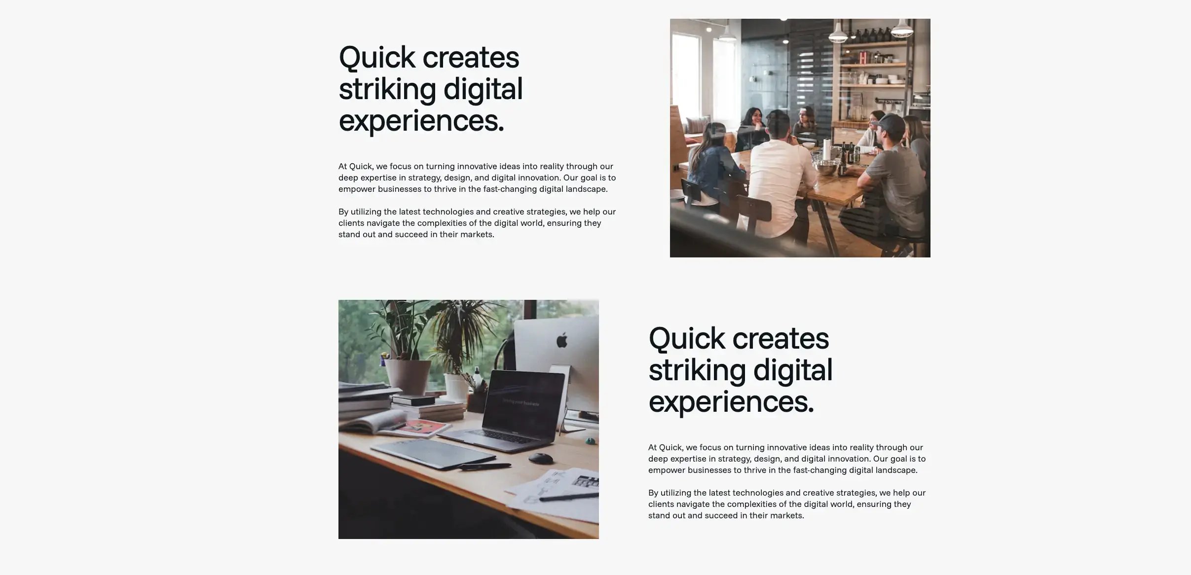
CONTENT WITH IMAGE SWAP
A split-layout module featuring multiple content blocks with corresponding images.
- Ability to add multiple content and image sections.
- Option to swap image and content alignment (left/right).
- Editable eyebrow texts.
- Ability to show/hide CTA button for each split section.
- Editable button label and URL.
- Edit font properties for all text elements.
- Background color customization for the module.
- Adjustable spacing and padding controls.
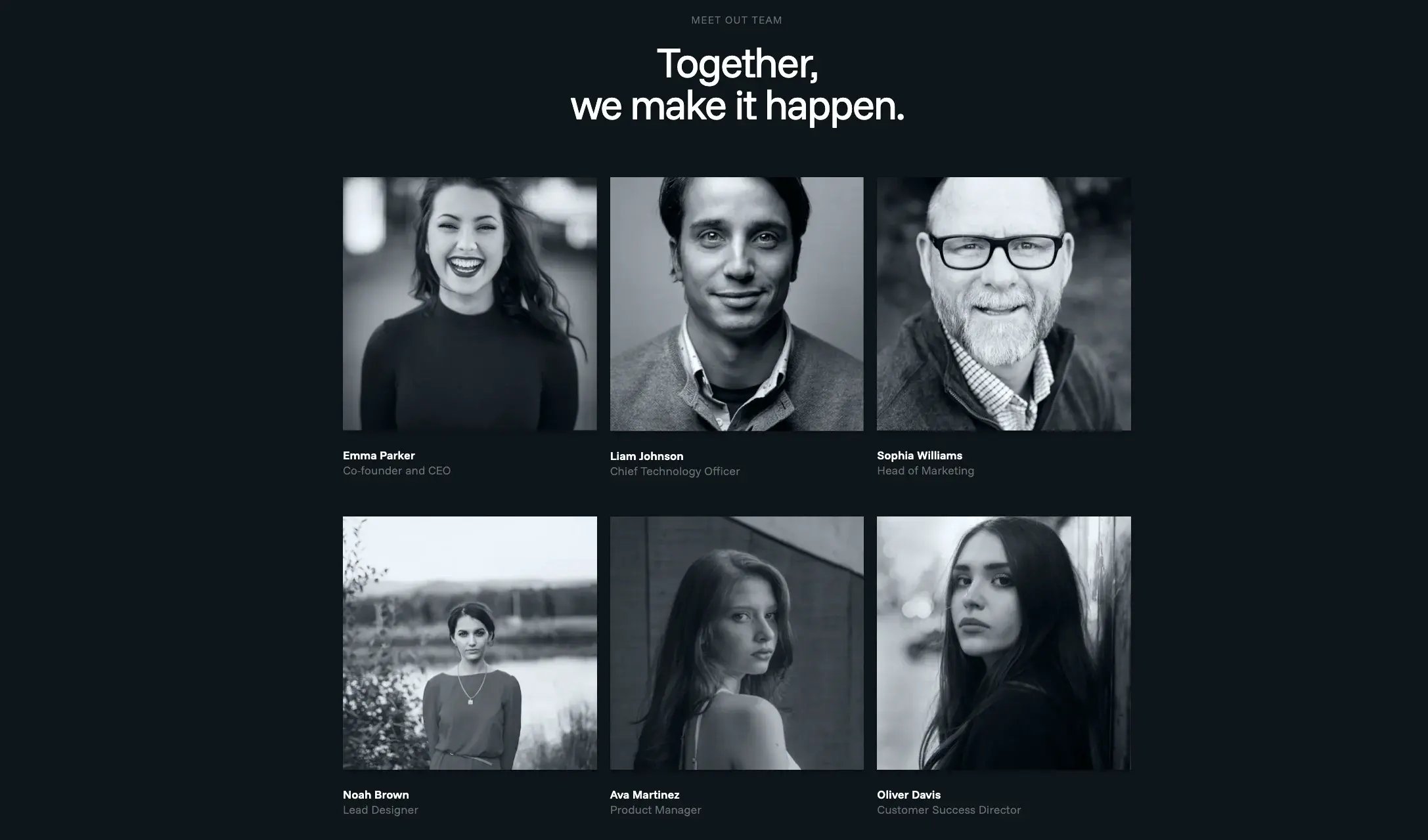
TEAM SHOWCASE
A modern team showcase section featuring a centered heading and a responsive portrait grid.
- Editable eyebrow label and heading text.
- Below the heading is a three-column team grid displaying member portraits with editable names and role/designation text underneath.
- Each team card supports:
- Changeable portrait image
- Editable member name
- Editable role/title
- Font color controls for all texts
- Adjustable spacing and padding controls
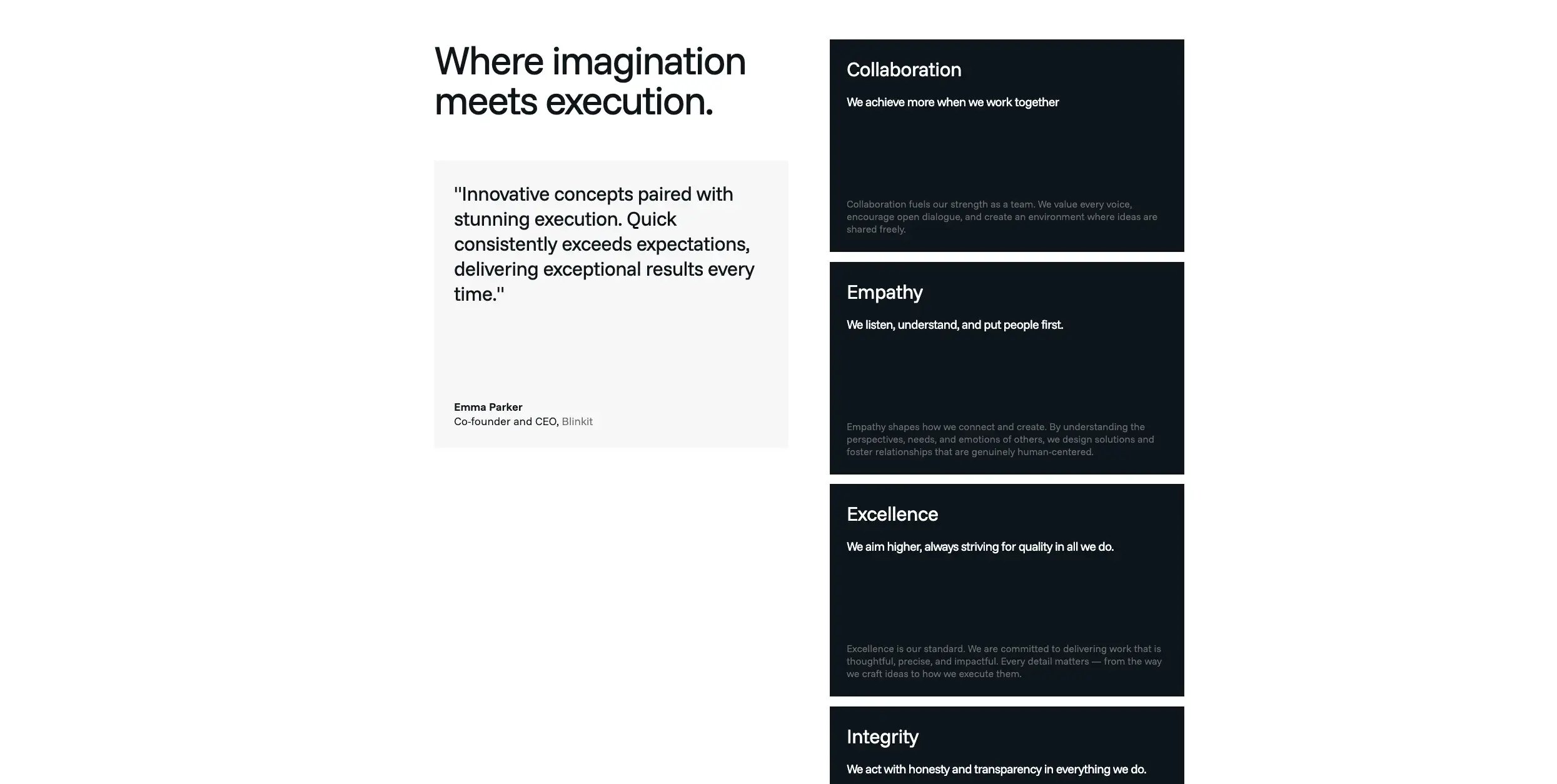
SCROLL CARDS SECTION
A responsive split-layout module combining:
- A testimonial card on the left
- A stacked values grid on the right.
- Editable heading and eyebrow texts.
- Editable left and right content.
- Background color customization for the module.
- Font color options for all texts in the module.
- Adjustable spacing and padding controls.
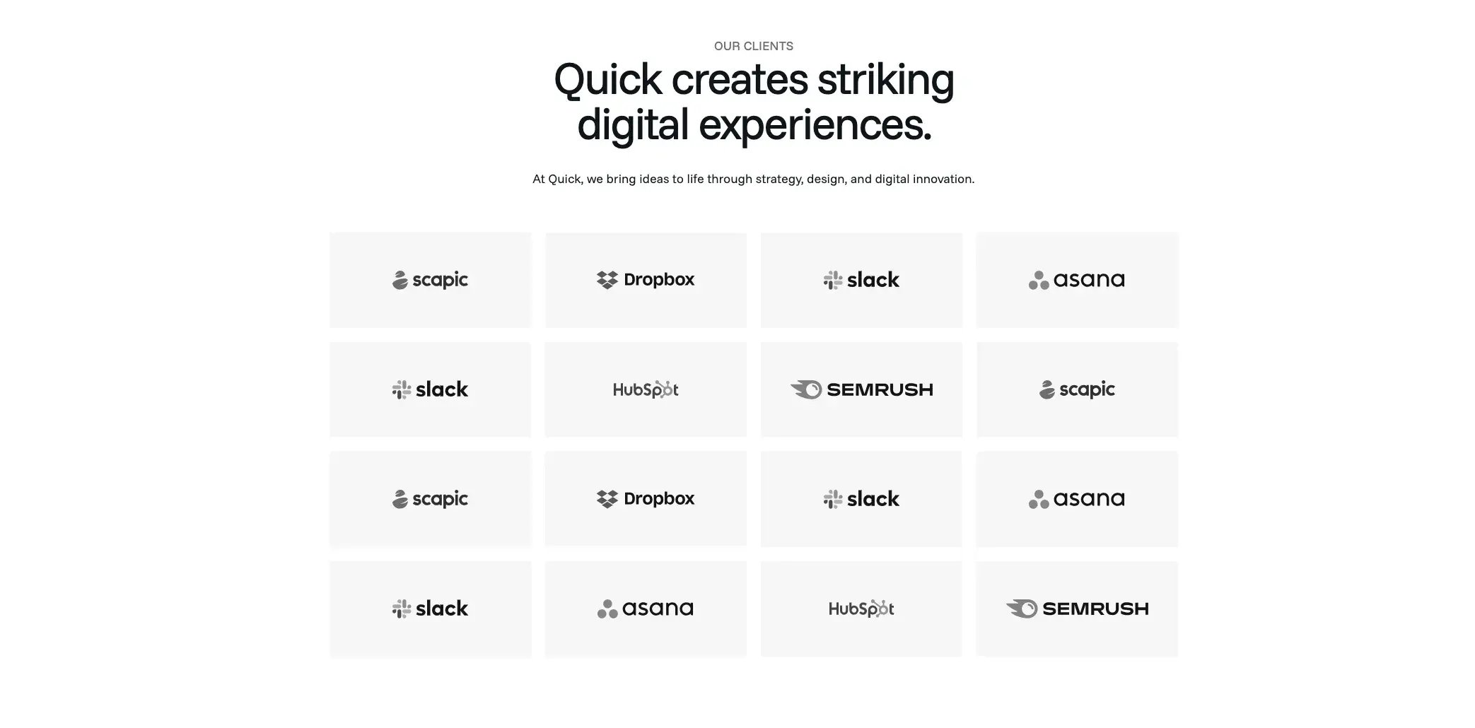
CLIENT LISTING V2
- Editable eyebrow label, heading, and description text.
- Changeable client logo/image
- Editable logo list and ordering
- Adjustable logo card background styling
- Font color controls for all texts
- Background color customization
- Adjustable spacing, padding, and grid gap controls
- Responsive column layout adjustments
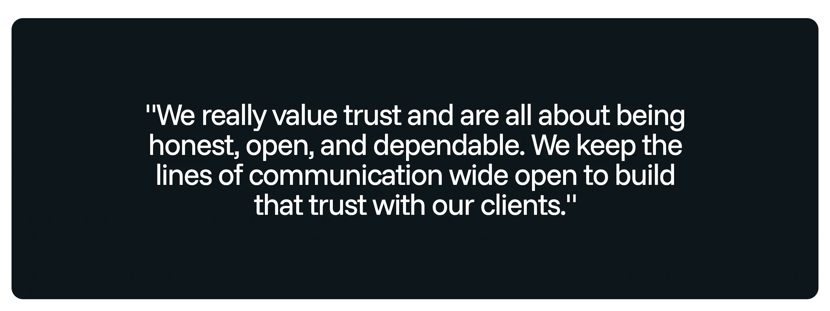
Single text banner
- Single text banner section used to highlight an important message, quote, or brand statement.
- Large centered text layout for strong visual impact.
- Dark background design that makes the message stand out clearly.
- Editable text content so the banner message can be updated easily.
- Supports quote-style content for testimonials, values, mission statements, or key messaging.
- Full-width section layout with inner spacing for clean presentation.
- Custom background color option to match the website brand style.
- Custom text color option for better design flexibility.
- Spacing controls for desktop and mobile padding.
- Responsive design support so the banner text adjusts properly on tablet and mobile screens.
- Reusable module suitable for:
- About pages
- Contact pages
- Service pages
- Brand value sections
- Testimonial quote sections
- Minimal content structure with no buttons or images, keeping the focus only on the main message.
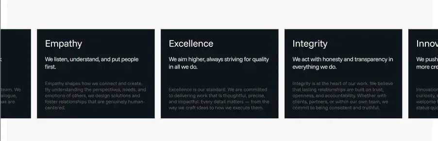
Services Carousel
- Horizontal carousel layout to display multiple service/value cards in a sliding format.
- Card-based design for presenting each service, value, or feature in a clean and structured way.
- Editable card title for each carousel item.
- Short description field to display a quick summary below the title.
- Detailed content field for adding supporting text inside each card.
- Responsive carousel behavior so cards can slide smoothly across desktop, tablet, and mobile screens.
- Custom spacing between cards for a clean and balanced layout.
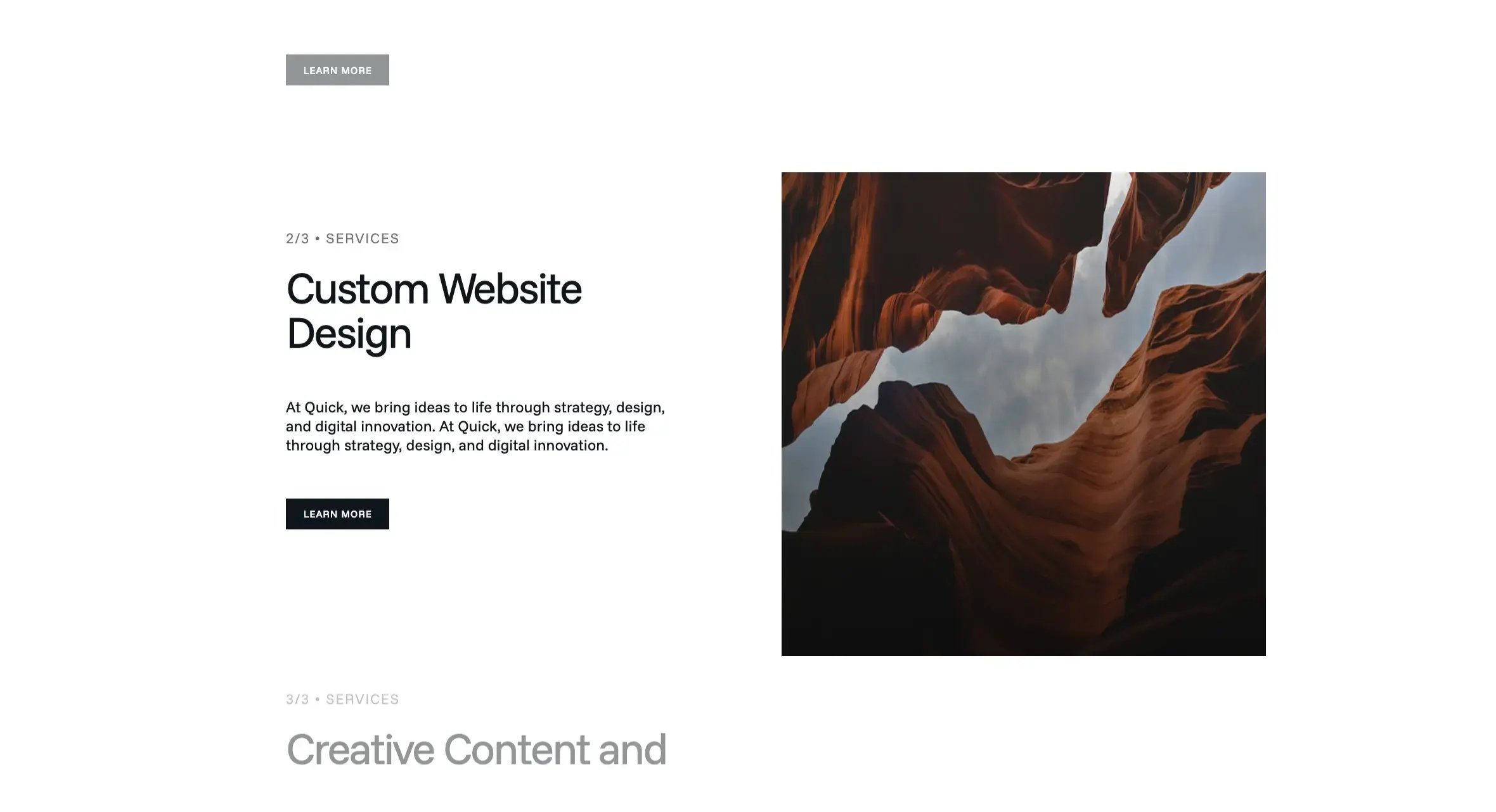
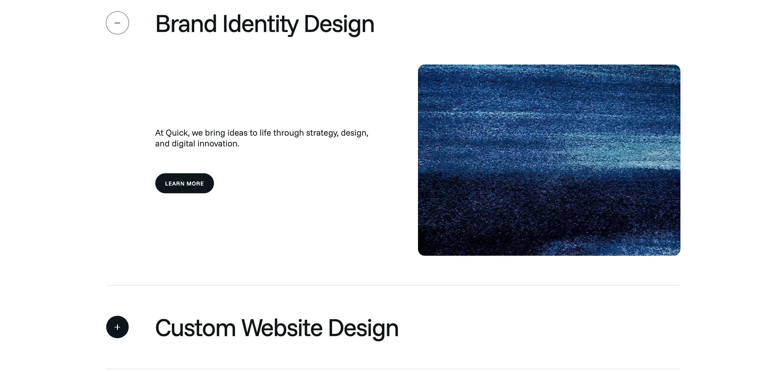
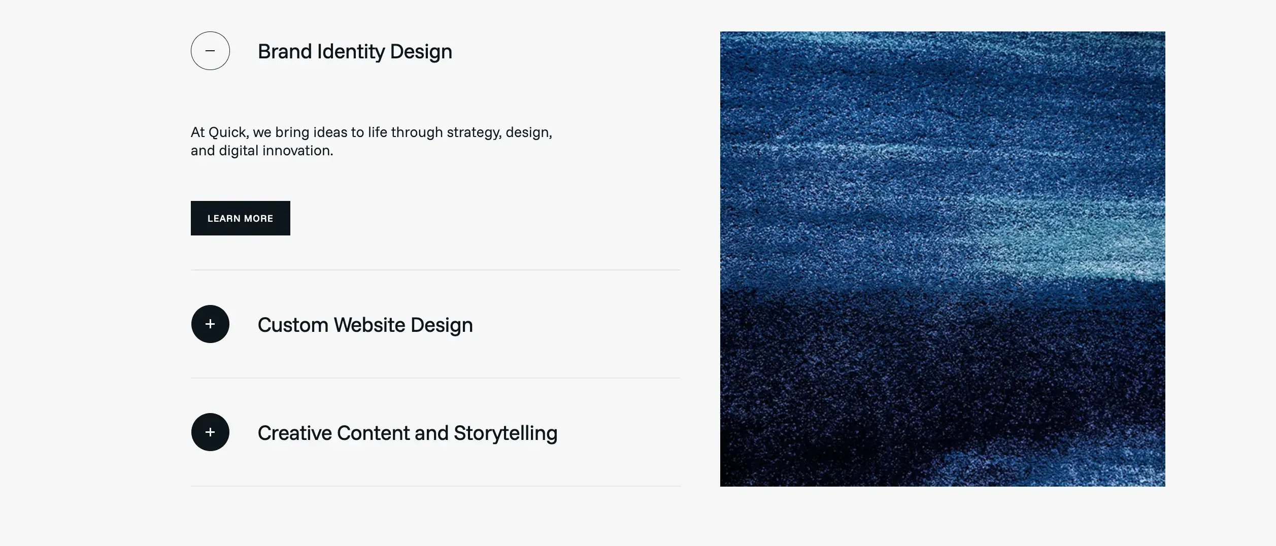
Services Accordion
- Accordion-style service listing with two layout variations supported.
- Expandable and collapsible service items using plus and minus icons.
- Active service item view showing detailed content for the selected service.
- Service title support for each accordion item, such as:
- Brand Identity Design
- Custom Website Design
- Creative Content and Storytelling
- Service description field to explain each service in short detail.
- Image support for each service item, allowing a related visual to appear when the item is expanded.
- Editable accordion items so services can be added, removed, or reordered easily.
- Custom icon style for opened and closed states.
- Responsive design support so accordion content stacks properly on tablet and mobile devices.
- Button customization options for text, link, background color, text color, and border radius.
- Spacing controls for section padding, item spacing, and content gaps.
- Reusable module suitable for:
- Services pages
- Home page service sections
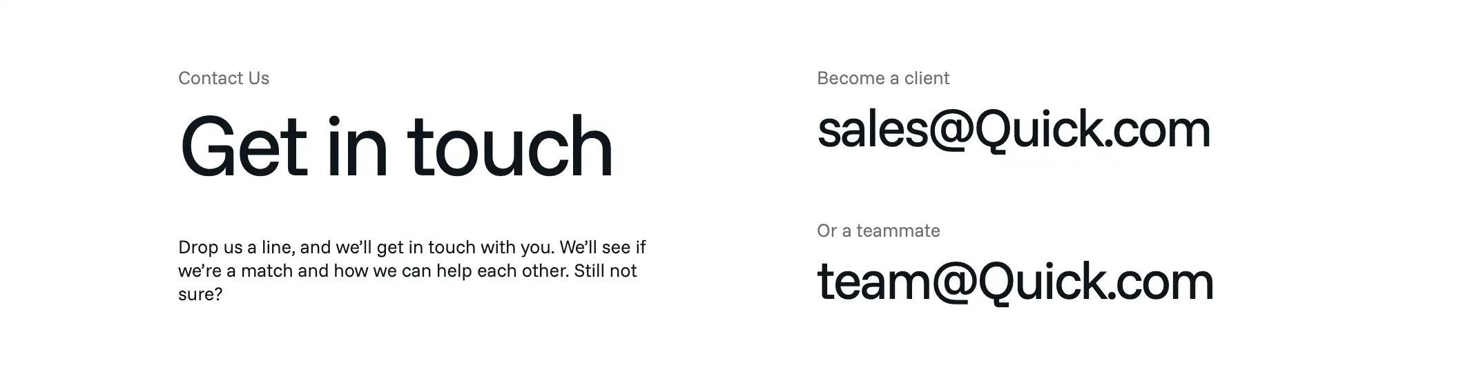
contact banner
- Clean two-column layout.
- Editable heading, description, and contact emails.
- Supports separate email contacts for clients and teammates.
- Large typography for better visibility.
- Minimal design suitable for modern websites.
- Can be reused on contact pages, landing pages, or CTA sections.
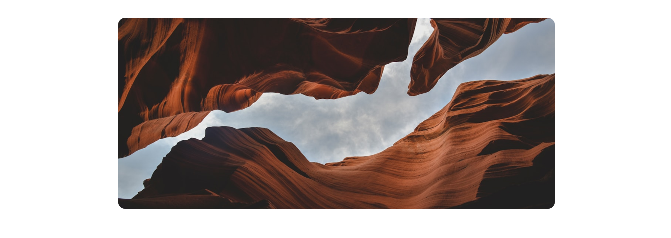
single feature image
- Full-width image display with a clean centered layout.
- Large visual section used to highlight a banner, featured image, or brand visual.
- Rounded corner image style for a modern and soft design look.
- Responsive image layout that can adjust across desktop, tablet, and mobile screens.
- Editable image field for uploading or replacing the section image.
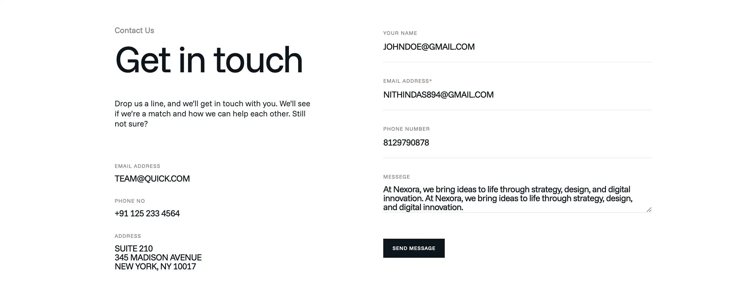
Contact Form
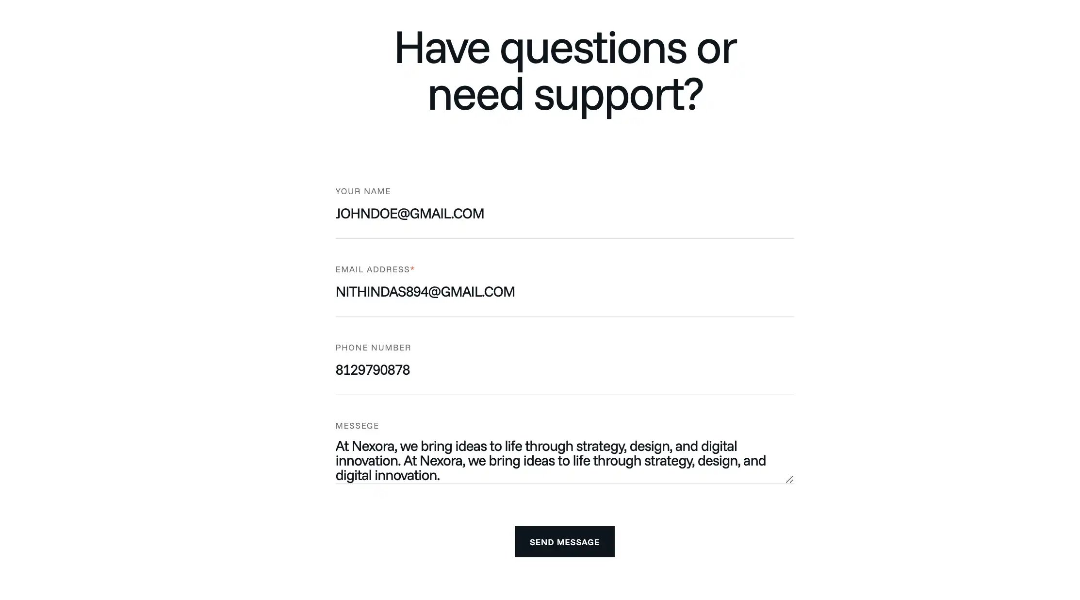
- Contact form section with heading, description, email, phone number, and address details.
- Contact form layout for collecting user details such as:
- Name
- Email address
- Phone number
- Message
- Two layout variations supported:
- Left content + right form layout
- Centered form layout with heading on top
- Editable heading and intro text for customizing the section content.
- Editable contact details for email address, phone number, and office address.
- Required field indicator support, such as the email field with *.
- Minimal input field design using underline-style form fields.
- Message textarea field for longer user messages.
- Submit button with editable button text, for example Send Message.
- Clean modern typography with large heading and simple labels.
- Responsive design support so the form can adjust properly on desktop, tablet, and mobile.
- Reusable module for contact pages, support pages, inquiry sections, or landing pages.
- Style customization options for text color, button color, spacing, alignment, and section padding.
Contact Location
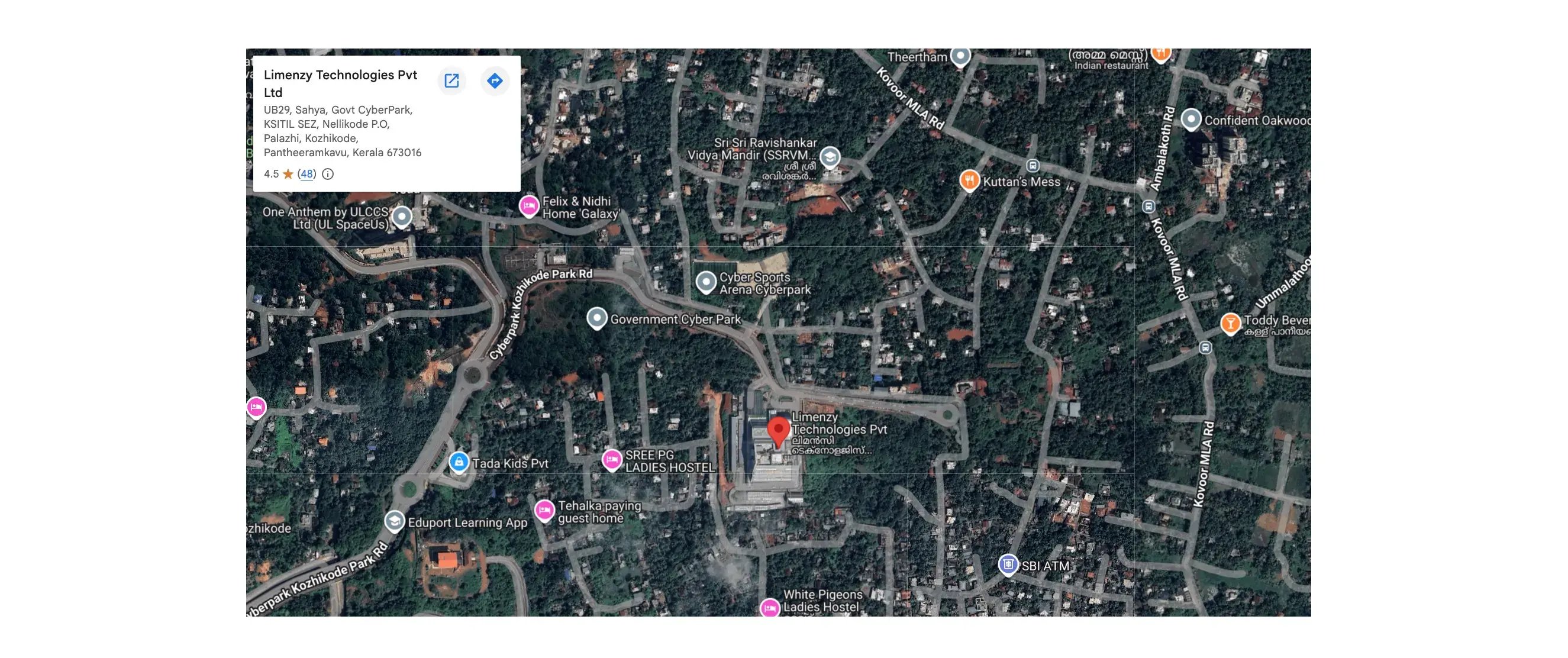
- Embedded map section to display the business or office location clearly on the page.
- Google Maps location view with a pinned marker showing the exact company address.
- Location information card displayed inside the map, including:
- Company name
- Address
- Rating/review details
- Direction/open map options
- Full-width map layout for a strong visual presence on the contact page.
- Centered container layout to keep the map aligned with the website content width.
- Interactive map support, allowing users to zoom, move around, and explore nearby places.
- Clickable direction option so visitors can open Google Maps and navigate to the location.
- Custom map embed support using Google Maps iframe or embed URL.
- Editable location/address field for updating the office location when needed.
- Responsive design support so the map displays properly on desktop, tablet, and mobile devices.
- Reusable contact section module suitable for:
- Contact pages
- Office location sections
- Branch/location pages
Portfolio Listing
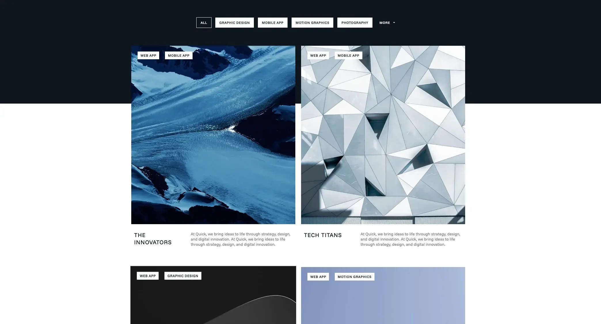
- Portfolio listing section used to showcase projects, case studies, creative work, or completed client work.
- Filterable category tabs allow users to view portfolio items by type.
- “More” filter option support for displaying additional hidden categories when there are many tags.
- Grid-based portfolio layout to display multiple project cards in a clean and organized structure.
- Large project image support for visually highlighting each portfolio item.
- Category tag badges displayed over the image to show the project type.
- Responsive layout support so portfolio cards stack properly on tablet and mobile devices.
- Custom category/tag support for organizing projects based on service type or industry.
- Style customization options for background color, text color, tag color, spacing, and grid gaps.
- Reusable module suitable for:
- Portfolio pages
- Case study sections
- Agency project showcases
single post details
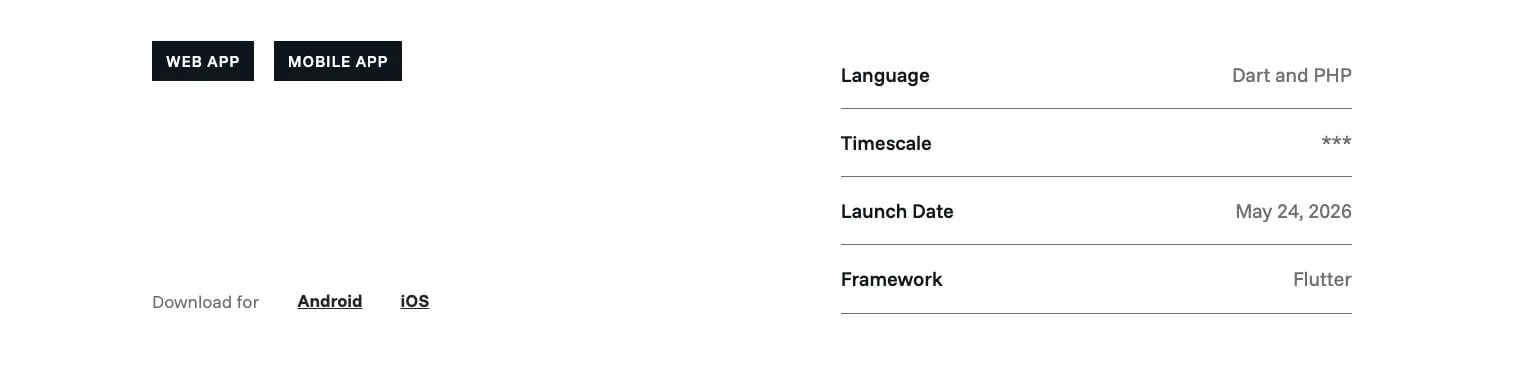
- Single post details section used to display key information about a portfolio item, case study, app, or project.
- Category tag display to show the project type.
- Download link area for adding platform-specific links, such as:
- Android
- iOS
- Project information table for presenting important details in a clean row-based layout.
- Editable detail rows for adding project-specific information such as:
- Language
- Timescale
- Launch Date
- Framework
- Two-column layout with download/category information on the left and project details on the right.
- Clickable download links for external app store, website, or file download destinations.
- Responsive design support so the details stack properly on tablet and mobile devices.
- Reusable module suitable for:
- Portfolio single pages
- Case study detail pages
two column image with header
- Displays an eyebrow label and large heading.
- Supports two side-by-side images.
- Useful for portfolio, case study, and project detail pages.
- Editable heading, label, and image fields.
- Clean two-column visual layout.
- Responsive design for desktop, tablet, and mobile.
- Customizable spacing, image gap, content width, and text colors.

full width background image
- Displays a large full-width background image.
- Useful for hero sections, banners, and visual breaks.
- Supports editable background image.
- Image covers the full section width.
- Customizable section height.

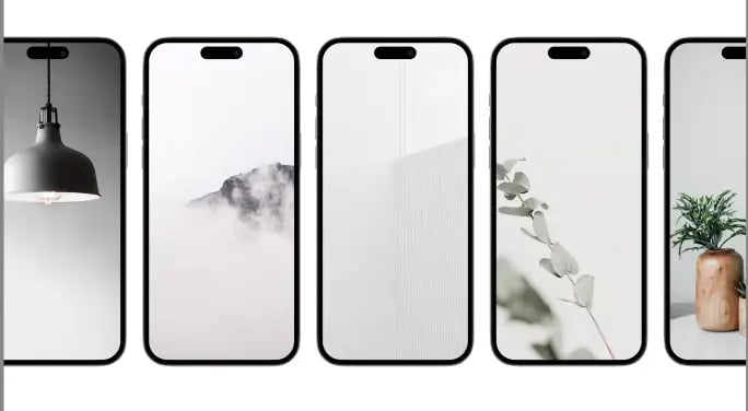
Mobile Frame Carousel
- Displays images inside mobile phone frames.
- Supports horizontal carousel sliding.
- Useful for app screens, UI previews, and mobile showcases.
- Multiple phone mockups can be shown at once.
- Editable image for each mobile frame.
- Supports autoplay and smooth scrolling.
- Responsive layout for desktop, tablet, and mobile.
- Customizable spacing, slide speed, and carousel gap.
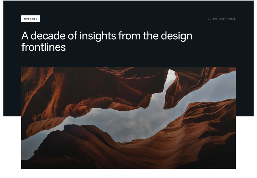
Blog Post Banner
- Displays a blog post hero/banner section.
- Shows the blog category tag.
- Supports blog post title display.
- Includes published date.
- Displays featured image below the title area.
- Dark background banner for strong visual focus.
- Useful for single blog post pages.
- Editable/automatic blog title, category, date, and featured image.
- Responsive layout for desktop, tablet, and mobile.
- Customizable spacing, text color, background color, and image size.
Templates
Quick includes a collection of professionally designed, ready-to-use templates tailored for IT companies, SaaS platforms, startups, agencies, and modern technology businesses. Each template is fully responsive, easy to customize, and built using reusable drag-and-drop modules.
Fully Customizable
All templates support HubSpot’s drag-and-drop editor and can be customized easily using:
- Theme settings
- Global styles
- Custom modules
- Header and footer variants
- Typography and color controls
This flexible template structure helps you quickly build a complete and consistent website experience using the Quick theme.
Home Template
A modern homepage template designed to showcase your brand, services, achievements, featured projects, testimonials, and call-to-actions in a professional and engaging layout. There are 3 variants of home pages available in this theme.
About Template
Designed to introduce your company, team, mission, values, and story with clean content sections and modern visual layouts.
Case Study Template
Perfect for presenting detailed project showcases, client success stories, workflows, and business results in a structured format.
Contact Template
A conversion-focused contact page with contact forms, office details, maps, and additional business information for easy customer communication.There are 2 variants of Contact pages available in this theme.
Portfolio Listing Template
A visually organized portfolio layout for displaying projects, works, products, or case studies in grid and listing formats.
Landing Page Template
A focused high-conversion landing page template ideal for campaigns, lead generation, product launches, and marketing promotions.
Services Template
A professional services page layout designed to highlight your business offerings, workflows, features, and expertise clearly and effectively.